Back to Results
Branding
ShelfChart
Brand Identity • Logo • Brand Colors • App Icon • Brand Guidelines
Dubai grocery price comparison • Crowdsourced shopping app
Brand Identity • Logo • Brand Colors • App Icon • Brand Guidelines
Dubai grocery price comparison • Crowdsourced shopping app
A full brand identity for ShelfChart, a crowdsourced grocery price-comparison app built for shoppers in Dubai. Makreate named the territory, drew the logo, locked the colours and type, and handed over a production brand book.
Tagline: Buy Smart. Compare on Shelf Chart.
ShelfChart helps a shopper in the aisle compare grocery prices across stores and pick the better buy. The product needed a name people could say out loud, a logo that still reads on a phone icon, and a colour system that feels at home in Dubai without looking like another imported supermarket brand.
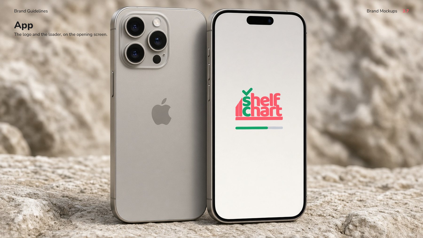
Makreate took the brand from an open naming field to a finished identity: wordmark, monogram, app icon, palette, type, clear-space rules, and a brand book with the logo already living on a phone, a bag, a bottle, and a leaflet.
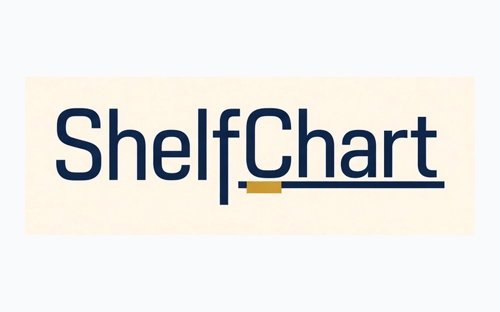
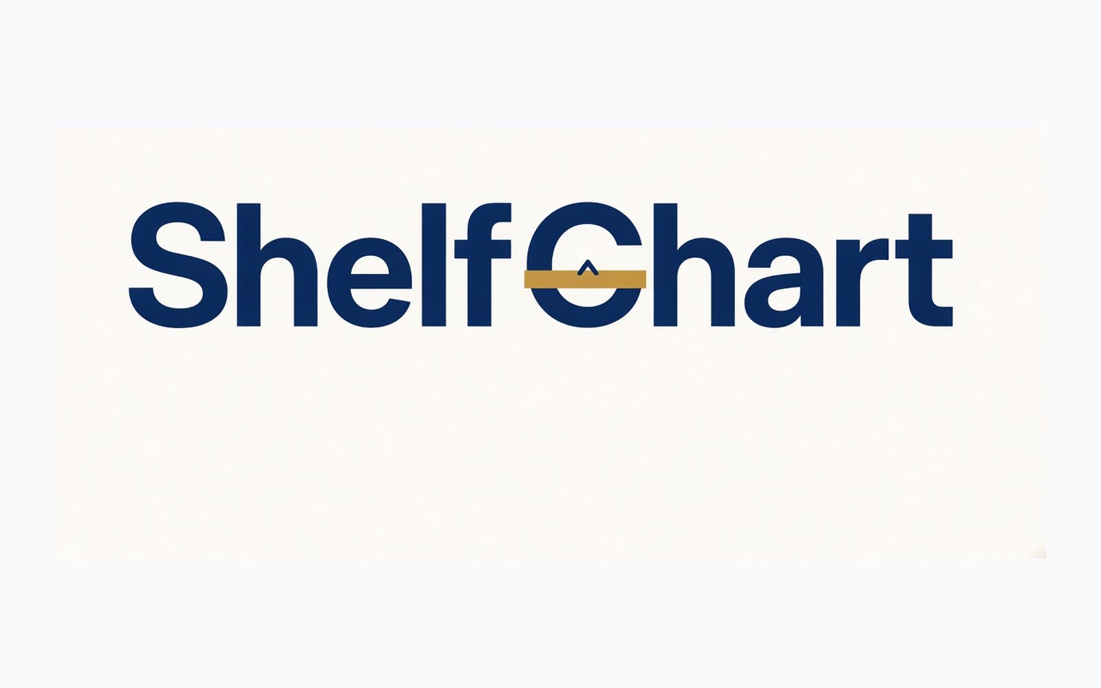
The first wordmarks set the name in type. A shelf line sat under the letters. The idea was right. The mark still looked like a word with a rule under it, the kind of logo a shopper scrolls past. These two routes are from 10 September 2026, the day the drawing work started in earnest.
We started with the job in the aisle: scan, compare, choose. Naming ran wide before any logo was locked. The working set included a 308-name candidate list, one-word and compound routes, competitor research, and domain checks on .com and .ae. The shortlist had to be easy to say, easy to spell, and obvious once you heard what the app does.
ShelfChart won that test. Shelf is where the decision happens. Chart is the comparison. Together they tell a shopper what the product is before the icon finishes loading.
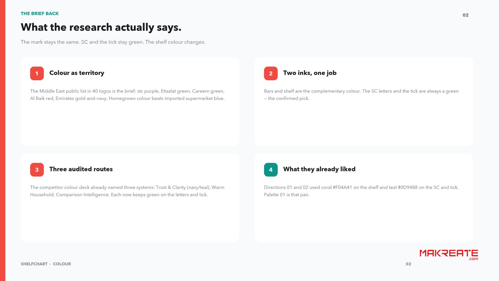
Colour research looked at marks people in the region already love: stc purple, Etisalat green, Careem green, Al Baik red, Emirates gold and navy. The lesson was practical. Homegrown colour beats a generic supermarket blue. The logo could carry two inks with one job each. The shelf colour can move. The letters SC and the tick stay green, because green is the confirmed pick.
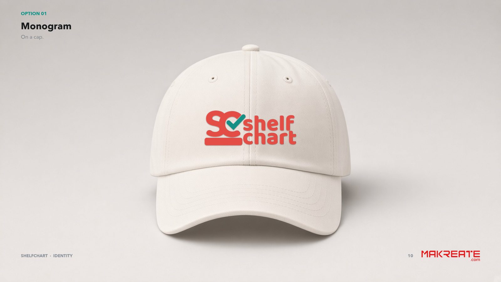
On 11 September 2026 we presented three complete logo directions. Each one was a full route, shown as a mark and then in the world, so the decision was about a system and not a sketch.
The strategy was simple. The name should be a drawing of the product. A shelf. Price bars. A tick for the pick you keep. Picnic pink for the shelf, because it is bright in a Dubai grocery aisle and it sits apart from navy fintech and teal comparison tools. Leaf green for SC and the tick, because that is the yes.
Type stays out of the logo. Nunito, in ExtraBold, SemiBold, and Regular, handles headlines, prices, and body. The line under the name is the brand line: Buy Smart. Compare on Shelf Chart.
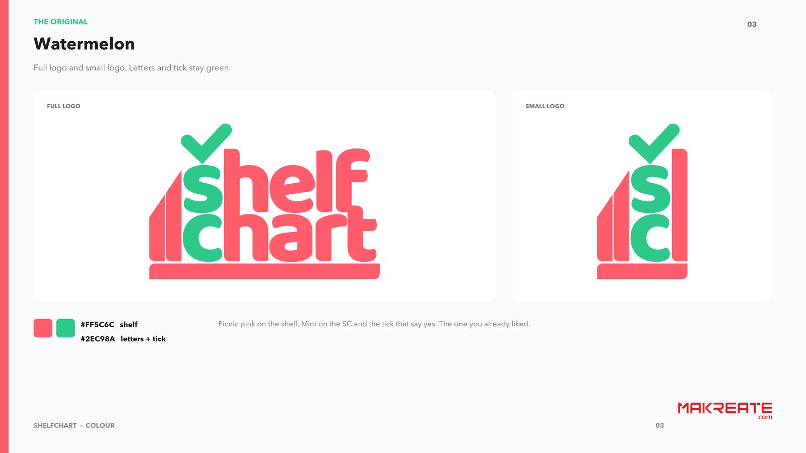
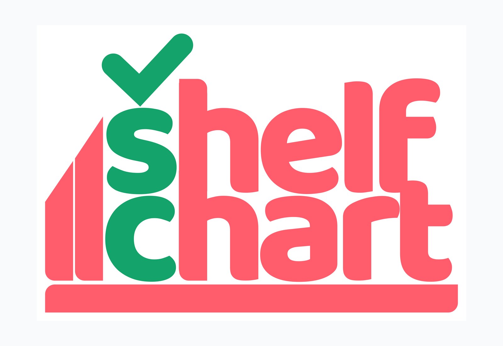
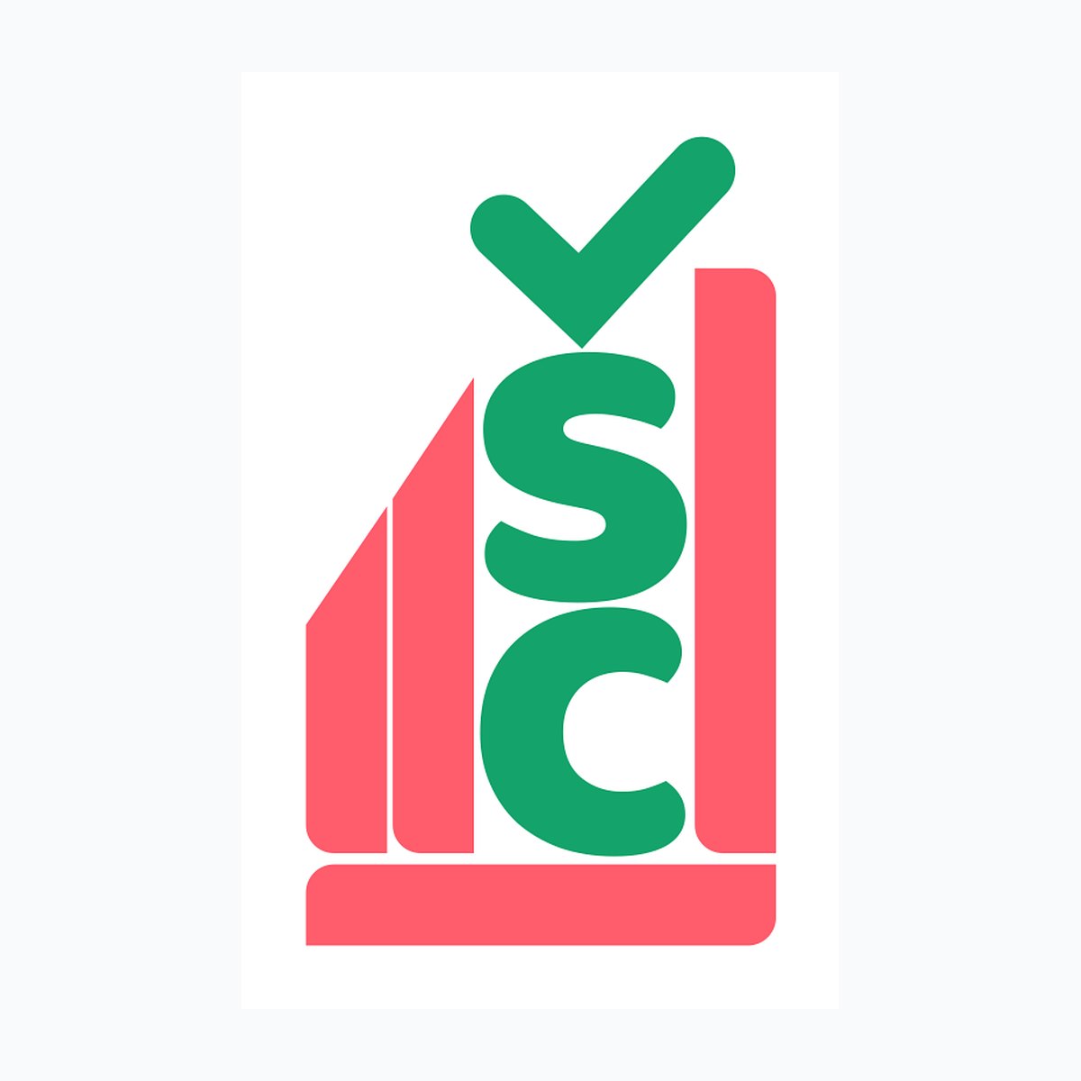
The production wordmark is custom drawn. The bars are the shelf. The tick is the decision. SC is leaf green. The rest of the word is picnic pink, #FF5C6C, and the green is Leaf, #14A36A. Clear space is the height of the tick on every side. Nothing else sits inside that box.
The app icon reduces the same drawing to SC, the shelf, and the tick, so the home screen and the splash screen are the same brand. Interface colours were specified with the logo: Ink, Muted, Line, Paper, White, Pink soft, and Leaf soft, including the save row. The brand book shows the hierarchy in the product’s own words. ExtraBold: Find the lowest price. SemiBold: Compare. Regular: Groceries across Dubai. Four stores. One pick.
The speed is in the file record. Early wordmarks on 10 September. Three full directions on 11 September. On 17 September the refined wordmark, the identity system, and the colour palettes landed in the same working day. A bright-palette round followed overnight and was ready on 18 September. By 12 October the production brand book was packaged.
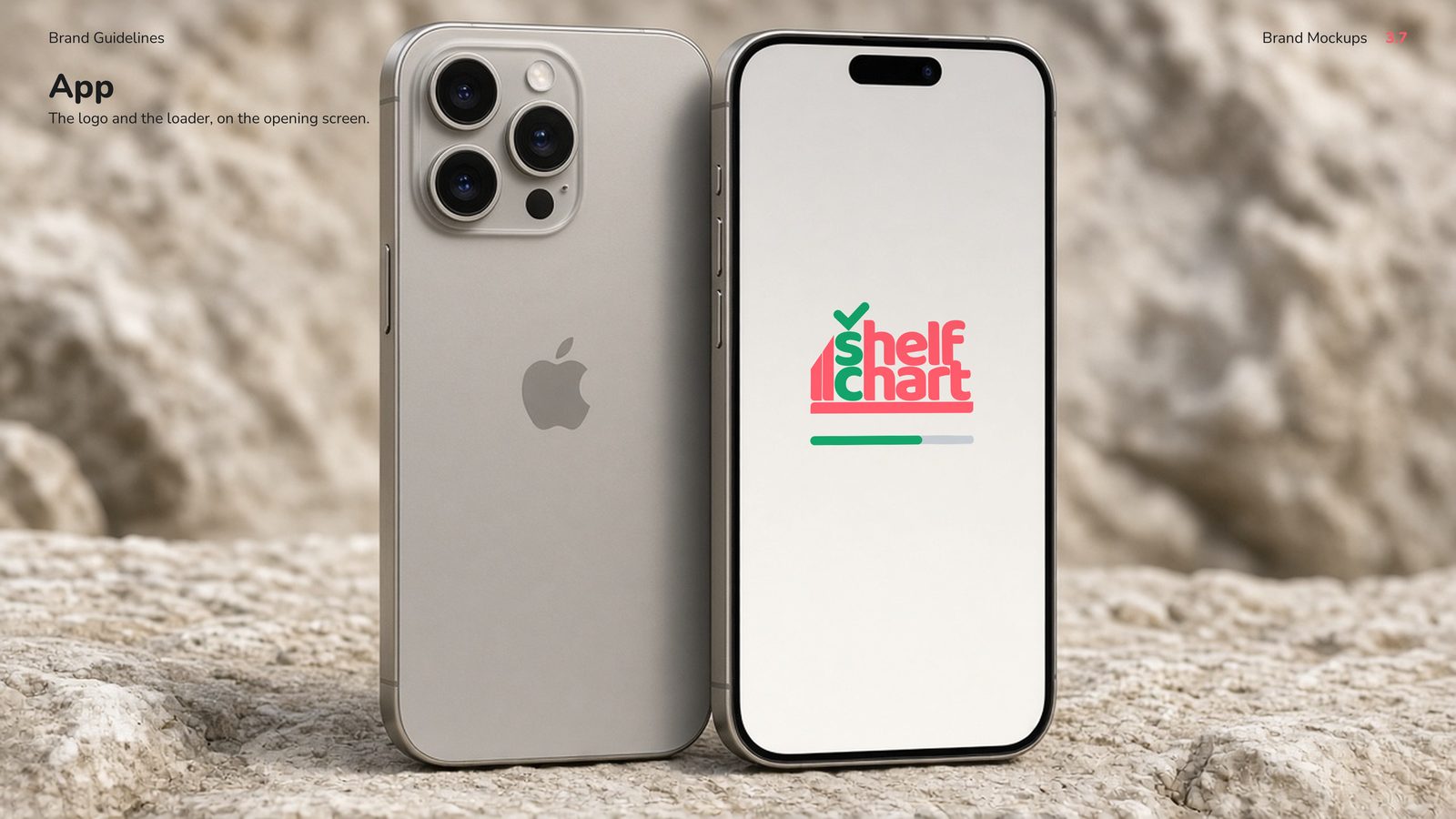
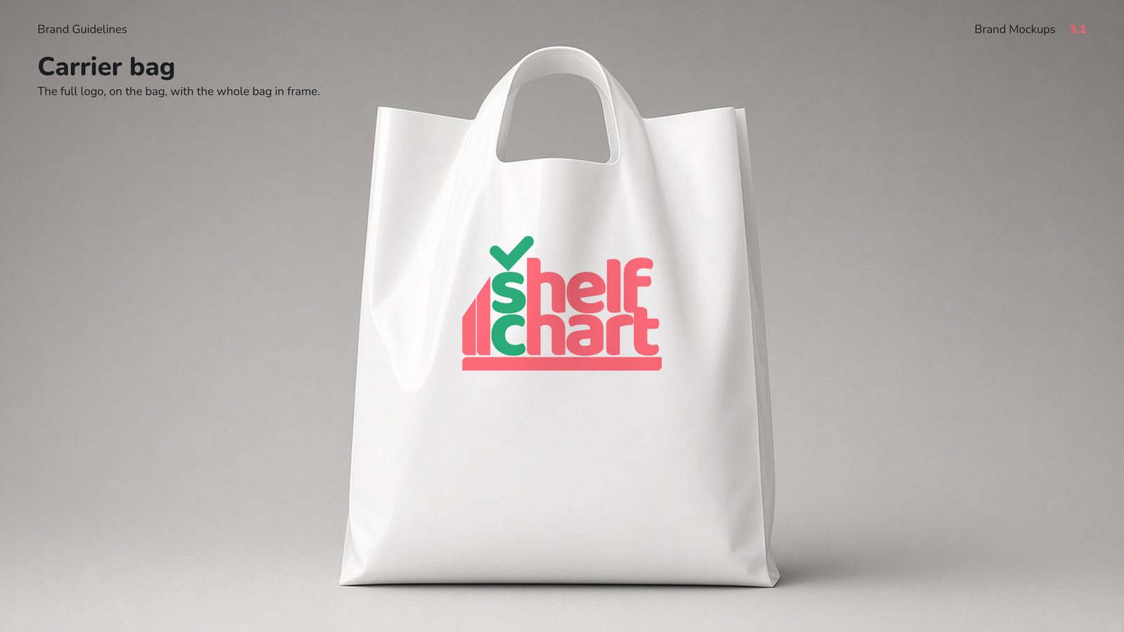
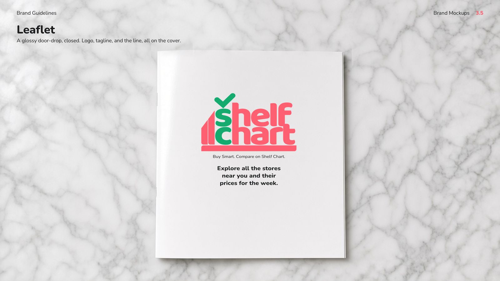
The same drawing was then placed where a shopper in Dubai would actually meet it: on a carrier bag in the city, on three posters in a Metro station, and on a set of three banners.
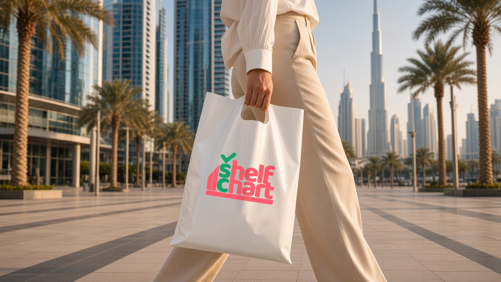
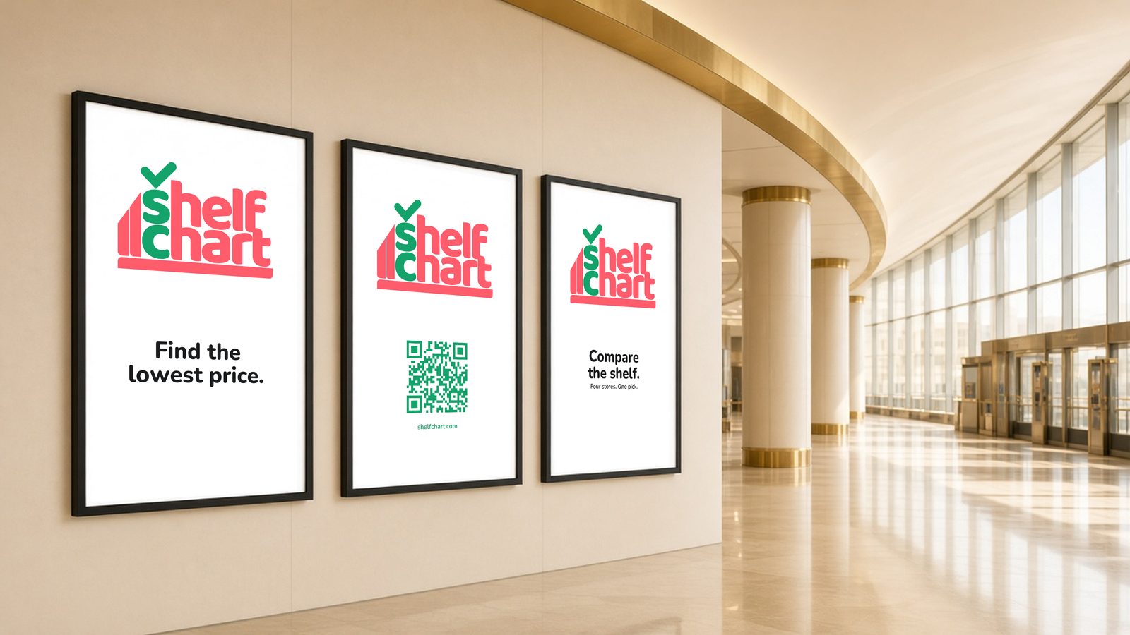
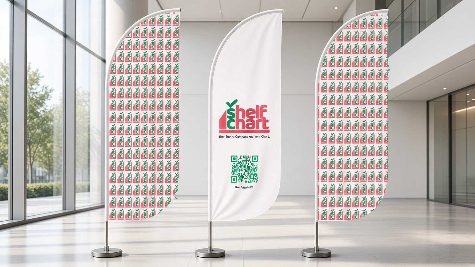
ShelfChart left the project with a brand that can ship. SVG logo and mark, PDF logo, a 1024px app icon, Nunito webfonts, colour tokens in CSS, JSON, and plain text, and a brand guidelines book that already shows the logo on the phone, the bag, the bottle, and the leaflet.
The quality is in the restraint. One drawing. Two inks. One type family. A tagline a shopper understands the first time they hear it. The speed is in the calendar: a typeset wordmark, three complete directions, a refined identity, and a colour system inside nine days, then a production brand book ready to hand to product and engineering.
Logo and monogram, app icon, colour system, Nunito type specification, clear-space and usage rules, tagline, and applied mockups for the app, print, and packaging. The files are production files, ready for a splash screen, an app store icon, and a brand page.
What does a Makreate brand identity include? For ShelfChart it included the name territory, three full logo directions, the final drawn wordmark and monogram, the app icon, the colour system, the type system, usage rules, and a brand book with real applications.
How fast can a full brand system be ready? The ShelfChart visual system moved from early wordmarks on 10 September 2026 to three presented directions on 11 September, a refined identity and colour system on 17 and 18 September, and a packaged brand book by 12 October 2026.
Who is ShelfChart for? Shoppers comparing grocery prices in Dubai. The brand is built for the aisle, where someone scans, compares, and chooses.
Tell us about your goals — we’ll come back within 1 business day with a plan.